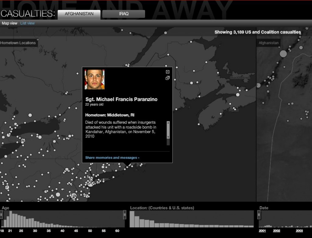
It can take a huge amount of time and effort to build an interactive graphic that’s both visually engaging and informative. That’s why many news organizations only make the effort for projects that will have a long shelf life. CNN made the investment for a long-term project called Home and Away that chronicles casualties from the wars in Afghanistan and Iraq. It’s basically two connected maps–one showing the home towns of those who died in the wars and the other the locations in the country where they died.
The company that built the graphic, stamen design, calls the project “a sobering look at the human cost of two wars” and says that explains why it uses “a restrained and sober palette of blacks, whites and greys.” It works on two levels. The opening screen shows the overall impact of each war on every country that sent troops. From there, the user can explore the impact by year, age group and state. The data is searchable, and each entry allows users to share messages and memories.
It’s an impressive piece of work that won the top award at this year’s inaugural Information is Beautiful contest. Explore the site to see other examples of data journalism and interactive visualizations. Prepare to be inspired!

